Rediscovering the joys of meaningful BI design & how Gemini’s “Ask & Learn” AI chat on Youtube helped to accelerate this process
Context
In a world where dashboards can be spun up in minutes with the help of AI, it’s easy to forget the value of slowing down — of truly understanding the story behind the data. This project takes a closer look at five years of vehicle crash trends across New York City, transforming raw numbers into meaningful visual insights through intentional BI design.

Time it took
Using the OData connector, from NYC Open Data’s Motor Vehicle Collisions – Crashes Dataset set up time took around 5 minutes, understanding the context behind the data took around 30min.
While building standard charts with limited formatting would have been a significantly easier feat, I wanted to build a more complex chart to promote the power of visuals and how it can encourage users to retain insights from Data better.
I was inspired by a Tableau Public visualization I saw a couple years ago, which at the time was featured as Viz of the Day. A stunning Radial Column and Bubble chart about the poster’s breastfeeding journey over the course of the year. The dashboard left a huge impression on me at the time, and to this day, I still remember how it looked, a true masterpiece. Information is Beautiful – A Breastfeeding Journey by Louise Shorten
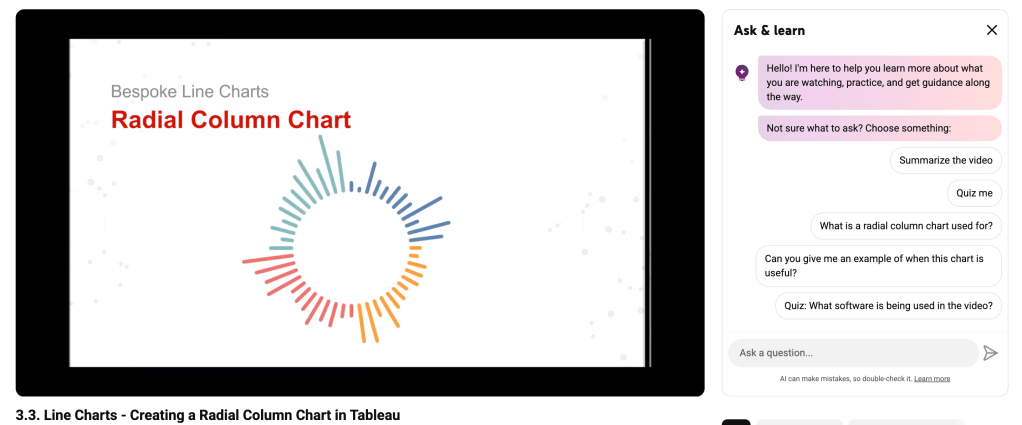
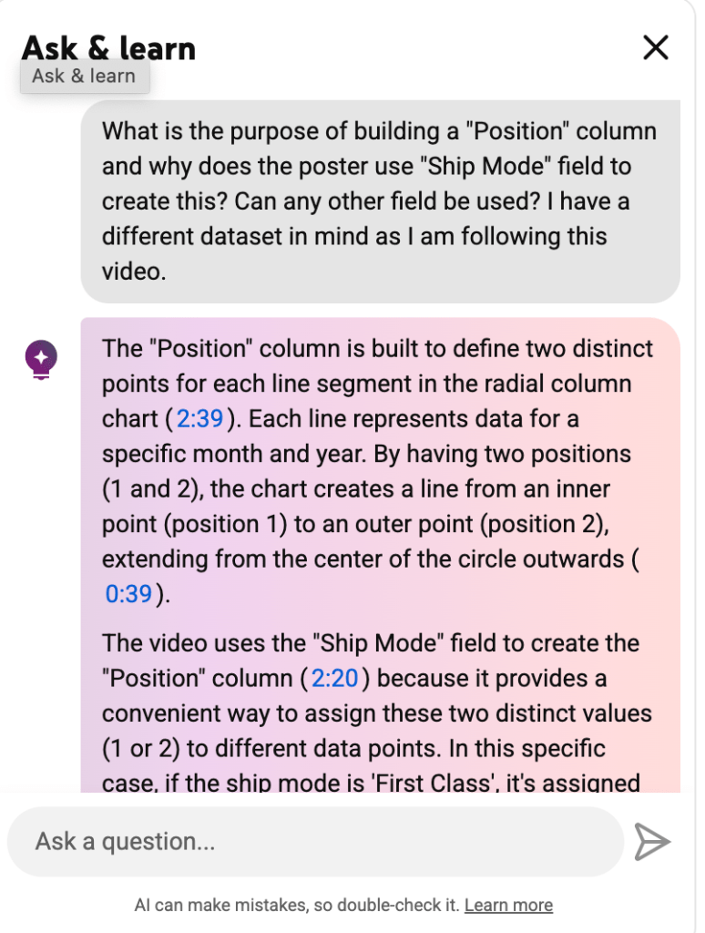
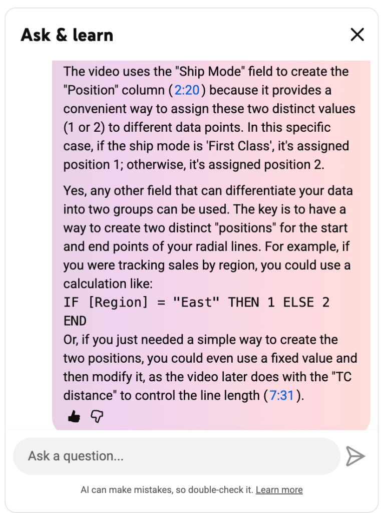
In order to build Radial charts like that in Tableau, several custom calculated fields needed to be built and there is a great tutorial (14min) on this I followed from Simplify Insights’ Youtube Video. Despite some parts of the video not fully explaining why certain steps were required, I was able to use Youtube’s new AI feature “Ask & Learn”, powered by Gemini – a serious game changer.
The Ask & Learn chat function is such an amazing feature, Google really hit the nail on the head here. In the past I would have had to either post my question to the video poster in the comments, wait for a response after a few days and then come back to my problem.
Now that I got the answers I needed, I could finally move forward with building the dashboard. Within about an hour, I had the Radial chart set up — a small milestone, but a satisfying one. With the “hard part” done, the focus shifted to what really makes a BI project meaningful: defining the story behind the visuals.
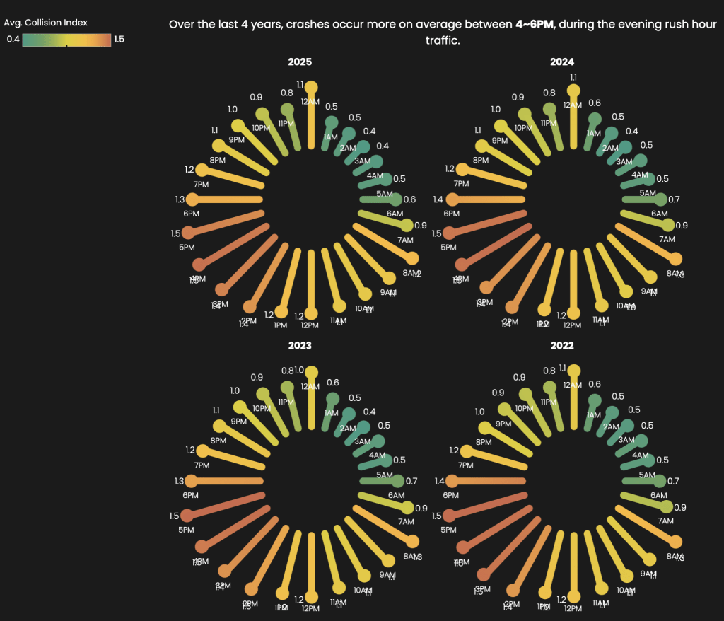
This stage is where thoughtful design truly matters. Just as consultants polish slides to make insights clear and compelling, data professionals refine dashboards to make data speak. My goal was to uncover insights that would resonate with me not just as an analyst, but as a New Yorker — understanding when and why crashes occur. Were there seasonal spikes? Did time of day or week influence the frequency of incidents?
After another round of data exploration, design iteration, and fine-tuning, I arrived at a clean, dark-mode dashboard interface that balanced form and function. The final result was more than just a collection of charts — it was an interactive story about NYC’s traffic patterns, built to help users explore the data with clarity and context.
Overall, the dashboard took around 3~4 hours to build & publish on Tableau public.
By investing the time to explore, clean, and visualize the data thoughtfully, I aimed to go beyond charts and tables — to uncover patterns that reveal how trends around time of year and time of day influence vehicle crash statistics in NYC. Building this dashboard wasn’t just a technical exercise; it was an opportunity to bridge data and empathy, proving that good analytics isn’t just about speed, but about clarity, context, and care.
Access the dashboard here:
https://public.tableau.com/views/VehiclecrashNYC/Dashboard1?:language=en-US&:sid=&:redirect=auth&:display_count=n&:origin=viz_share_link
TLDR
I built a BI dashboard to explore 5 years of NYC vehicle crash data. YouTube’s Gemini Ask & Learn AI chat helped me quickly learn how to create a Radial chart, but I took the time to design thoughtful visuals that reveal real patterns and stories behind the numbers. Sometimes, the best insights come from combining AI-driven speed with human intention.

Leave a comment